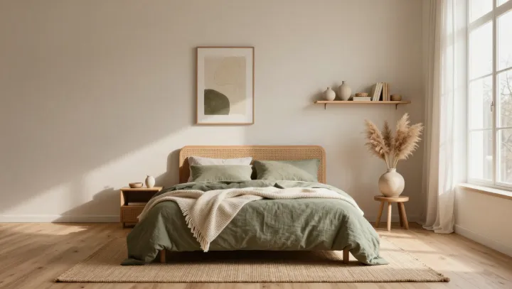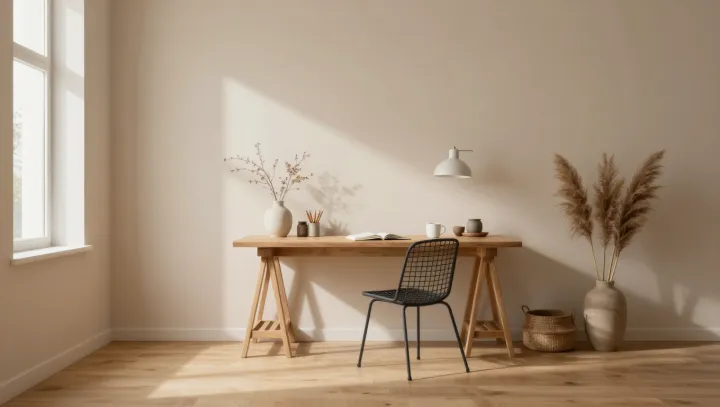
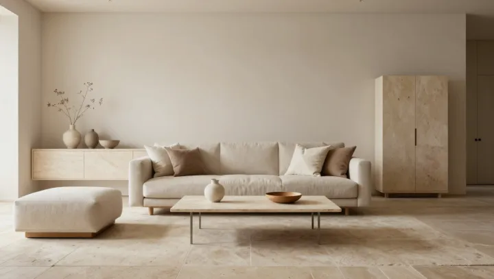
An almost empty beige living room can feel less like calm and more like a sensory blackout. Soft walls, pale sofa, bare coffee table: every surface repeats the same low-contrast signal. Neuroimaging studies on visual cortex load show that monotony forces the brain to hunt harder for edges, color shifts and depth cues, raising cognitive effort even as the room appears quiet.
The counterintuitive part is that clutter is not the only threat to attention; sensory underload can be just as draining. When a space offers almost no variation in hue, luminance or material, the default mode network and attentional control systems slide into a hazy in-between state, neither engaged nor truly resting. Heart-rate variability may flatten, and people report feeling strangely tired without obvious cause.
Small textured elements can interrupt that fatigue without dragging the eye into chaos. A rough ceramic bowl on the table, a boucle cushion, a woven tray on the floor: each adds micro-contrast in both color and tactility. Environmental psychology research on biophilic cues suggests that such low-level texture mimics the complexity of natural scenes, giving the visual system enough information to lock onto while keeping arousal low.
So the most restorative living rooms are not perfectly smooth beige boxes but minimal shells punctuated by a few deliberate, touchable anchors. They act like visual commas, letting attention land, rest, and move on, rather than drift in a blank, cream-colored sentence that never quite ends.