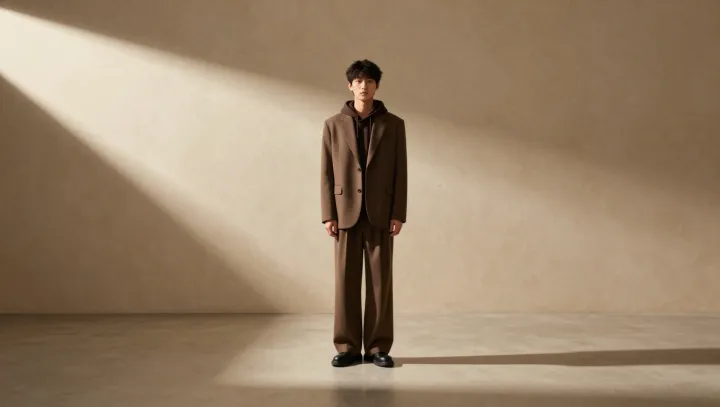
Soft afternoon light on a brown suit and hoodie does more than flatter fabric; it edits information. With logos stripped away and hardware muted, the eye has fewer data points to process, so the brain defaults to reading structure, silhouette and tone as the primary cues of value.
The blunt truth is that luxury is a hierarchy before it is a price tag. When a single brown hue controls both suit and hoodie, you get color harmony and reduced visual noise, which pushes the outfit into the same perceptual bucket as editorial styling and campaign imagery. Relaxed, slightly oversized tailoring introduces negative space around the body; that spatial margin functions like white space in graphic design, a form of visual hierarchy that signals control, confidence and scarcity rather than cramped necessity.
Soft, directional light finishes the trick. It creates gentle contrast, so seams, drape and surface texture read like design features instead of random folds, mimicking the way high-end lookbooks are lit. Deprived of branding shortcuts, the brain leans on gestalt grouping and figure ground separation, and because those cues resemble the visual grammar of luxury advertising, the outfit is quietly upgraded in status without a single visible logo.