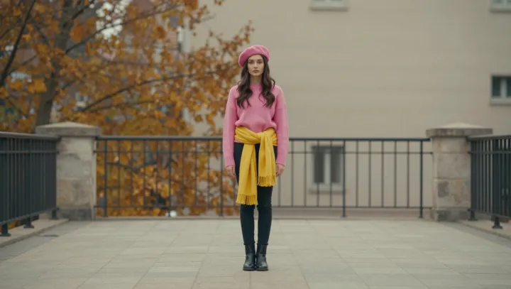
A loud clash of cobalt, orange and acid green often looks more self assured than a flawless beige suit. That is the claim many fashion psychologists now defend, pointing to research on color perception, social signaling and risk taking in dress. When viewers meet an outfit first, their visual cortex reacts to contrast and saturation before it notices cut or fabric, so high contrast pairings trigger faster attention and stronger memory traces than muted, tonally matched sets.
Bolder looks, these researchers argue, do not just grab the eye, they advertise a willingness to accept social risk, which observers routinely read as confidence and higher creative capacity. Experimental studies using color priming and self report scales show that people wearing vivid, intentionally mismatched hues report higher state confidence, while outside observers rate them as more original and higher status, even when the garments themselves are inexpensive. Smart clashing also hints at cognitive flexibility, because combining unexpected tones demands some grasp of color theory and aesthetic judgment rather than blind obedience to a dress code.
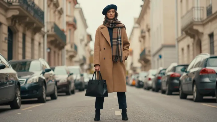
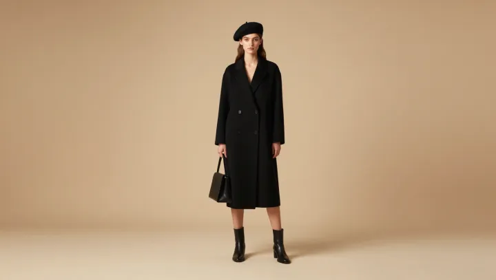
Perfectly matching neutrals, by contrast, signal safety first. They reduce visual noise, but they also erase personal authorship from the outfit, making the wearer blend into architectural backdrops and office interiors. When every piece harmonizes too neatly, observers often credit the brand or the stylist, not the individual, with any style success. So the person disappears into the palette, while the intentional color clasher steps forward as the likely decision maker, and in many social settings that is the only difference that counts.